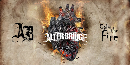
The new band logo
-
Electricladyland

- TABN.com Citizen
- Posts: 140
- Joined: Wed Jun 20, 2012 5:26 pm
- Location: Los Angeles, CA
Re: "New Logo"... Discuss
Anyone else getting a Fuel vibe from the new logo?
-
Fish Tacos
- Burn It Down
- Posts: 2721
- Joined: Sun Jan 26, 2014 12:52 pm
- Location: noʎ puᴉɥǝq ʇɥƃᴉɹ
Re: "New Logo"... Discuss
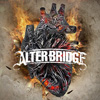
Here's my take on it. Jared's had some weird coloration going on around the bullseye where all the black bits lost contrast. I can only do so much without the original but I tried to fix that and move as much of the bullseye as I could behind the action.


Re: "New Logo"... Discuss
The eye is a crow...per Brian Marshall and after looking at it, I see it now lol.
Photobucket cash grab.
-
Fish Tacos
- Burn It Down
- Posts: 2721
- Joined: Sun Jan 26, 2014 12:52 pm
- Location: noʎ puᴉɥǝq ʇɥƃᴉɹ
Re: "New Logo"... Discuss
That's pretty dope!
Re: "New Logo"... Discuss
Can't really see it on any of these in this thread, but the one on fb is more clear and it's definitely there. Eye and foot and all.
Photobucket cash grab.
Re: "New Logo"... Discuss
Huh, hadn't noticed that lol. That's pretty cool.
anguyen92 wrote:Oh well. Deal with it.
-
chtimixeur
- On The Rail
- Posts: 1671
- Joined: Mon Jun 18, 2012 5:15 am
Re: "New Logo"... Discuss
I see Kratos from the God of War game


Re: "New Logo"... Discuss
I'm confused.. What have you done?Fish Tacos wrote:Here's my take on it. Jared's had some weird coloration going on around the bullseye where all the black bits lost contrast. I can only do so much without the original but I tried to fix that and move as much of the bullseye as I could behind the action.
-
Timotheus

- Little Belgian Waffle
- Posts: 16842
- Joined: Mon Jun 18, 2012 3:52 am
- Location: Belgium シ
- Contact:
Re: "New Logo"... Discuss
Put the face before the target in stead of behind.

anguyen92 wrote:Oh well. Deal with it.

Re: "New Logo"... Discuss
I love AB, but I am about to be that guy.
The Target inspired Green Day ripoff CD cover sucks. The new logo change is lame, the Fortress CD cover sucked, the Cauterize Frank Zappa tribute CD cover sucked... The rest were pretty good.

The Target inspired Green Day ripoff CD cover sucks. The new logo change is lame, the Fortress CD cover sucked, the Cauterize Frank Zappa tribute CD cover sucked... The rest were pretty good.
Re: "New Logo"... Discuss
I see it. I guess I also see a fetus in his ear.... and a oven mitt on his neck lol.Ryan wrote:The eye is a crow...per Brian Marshall and after looking at it, I see it now lol.
Re: "New Logo"... Discuss
Yeah if you scroll most of the way down this picture and have the top of your browser covering his lips... that picture looks like something very different I just found out....chtimixeur wrote:I see Kratos from the God of War game
Re: "New Logo"... Discuss
Haha of course! Didn't even recognise the difference, must not have looked at it enough to have realisedTimotheus wrote:Put the face before the target in stead of behind.
100% prefer it with the target going through him
Re: "New Logo"... Discuss
I was literally about to post the exact same thing!!Vaux wrote:Yeah if you scroll most of the way down this picture and have the top of your browser covering his lips... that picture looks like something very different I just found out....chtimixeur wrote:I see Kratos from the God of War game

Re: "New Logo"... Discuss
Looks nothing like thatVaux wrote:I love AB, but I am about to be that guy.
The Target inspired Green Day ripoff CD cover sucks. The new logo change is lame, the Fortress CD cover sucked, the Cauterize Frank Zappa tribute CD cover sucked... The rest were pretty good.
For all of the hope that it brings...
Re: "New Logo"... Discuss
I didn't really mean the logo.... but yeah... the black and white with the only color being red.. well that part is totally different. 
Re: "New Logo"... Discuss
It's actually not white but beige.. our first edit that was massively shared was a bit over the top with messing with the levels and balance...Vaux wrote:I didn't really mean the logo.... but yeah... the black and white with the only color being red.. well that part is totally different.
"Sing it, Stijn!"— Myles Kennedy, during Rise Today
Heineken Music Hall, Amsterdam, 3 November 2013
Re: "New Logo"... Discuss
I didn't really understand the updated logo when I first saw it on alterbridge.com. As others have said it just seems bland; the only think unique about it is that it's still arched like a bridge.
Now having seen the album art, it totally works. I'm still not sure it's suited to standalone applications (e.g., stage banners, tour posters, etc.), but it's perfect for the album cover.
Very cool that Brian pointed out the crow in the eye. Kind of funny that wrinkles on the outer edge of the eyelid are often referred to as "crow's feet."

Re: "New Logo"... Discuss
I'm just really worried about how they're ever gonna do the infamous 'AB' logo now...
-
Cariocawlad
- Bought The CDs
- Posts: 87
- Joined: Mon Jul 16, 2012 8:27 am
- Location: Rio de Janeiro, Brazil
Re: "New Logo"... Discuss
Well, I really don't like it...this cover was made by Dan Tremonti? This will be the final cover to the album?