https://fbcdn-sphotos-b-a.akamaihd.net/ ... 7126_n.jpg
That needs to be the cover. Seriously. Pretty sure this is another Jared Ward edit.
Do you love the album art?
Re: Do you love the album art?
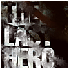
^Yeah, I like these kinds of edits a lot better. I think the contrast between this desolate, broken down shed and the title is really interesting so I prefer how these edited fonts kind of bleed into that environment and emphasize the bleak isolation. I'd actually like to see some edits that emphasize the contrast even more by making the Fortress title look more formidable so that contradiction is even more powerful. The red just overdoes it.
gbruin wrote:Everything Nick says is true. Even when he disagrees with me. Then it's extra true.
Re: Do you love the album art?
Well i mean, they could always change the cover... Aveneged Sevenfold changed the album artwork for their new one after a couple of weeks it was announced...

Re: Do you love the album art?
JSlade wrote:https://fbcdn-sphotos-b-a.akamaihd.net/ ... 7126_n.jpg
That needs to be the cover. Seriously. Pretty sure this is another Jared Ward edit.
"Whatever takes us away
Will be the same to drive us on."
Will be the same to drive us on."

Re: Do you love the album art?
That being said... Does it work?STEVE JOBS wrote: "Design is not just what it looks like and feels like. Design is how it works."
If I saw the cd on a shelf in a Walmart or Best Buy store, would I go towards it to see what's it about? Will people that never heard of Alter Bridge do it?
It certainly doesn't call the attention, it looks rather poor, especially from the distance.
And that's why they used red, it's a hot color that will help to drive the consumer looks at the package in the point of sale. it would totally disappear if it was all sepia and white.

-
10topprs

- Bought The CDs
- Posts: 88
- Joined: Fri Jun 22, 2012 9:52 pm
- Location: Knotts Island, NC
- Contact:
Re: Do you love the album art?
Figured I'd give my 2 cents... Don't like it. The photo is fine but the entire composition took 0 effort to put together and as many have already said... just poorly executed. I love Dan's past works but this is an addition he could have done without. I do this for a living... if my clients paid me and I presented them with this, they'd probably sue me haha

Re: Do you love the album art?
Jim did you do the cover for Black Out The Sun?
anguyen92 wrote:Oh well. Deal with it.
-
10topprs
- Bought The CDs
- Posts: 88
- Joined: Fri Jun 22, 2012 9:52 pm
- Location: Knotts Island, NC
- Contact:
Re: Do you love the album art?
Yeah man that was me  Mixed reviews on THAT piece haha. Metalsucks really kinda trashed it but for the most part people dug it I think
Re: Do you love the album art?
Lol I liked that one which was why I asked. The Projected cover was really awesome though. I did the smiley face in that contest. 
anguyen92 wrote:Oh well. Deal with it.
-
blackbirdgraphics

- Brand New Start
- Posts: 17
- Joined: Thu Aug 01, 2013 12:48 am
- Location: Washington D.C./Northern VA
- Contact:
Re: Do you love the album art?
If I had known there was a forum dedicated to this band I would have joined a hell of a lot sooner. Where have I been?
You know, this topic has been of great interest for me today. Not because of it's popularity on Twitter and Facebook, but because of what album art from Alter Bridge means to me. For the last 15 years, both Mark and his brother Dan have inspired me both musically and artistically. I know some who are reading this are thinking "jesus, shut up". Hear me out. Look, I did my Senior Seminar studio art portfolio based around studying Dan Tremonti's digital surrealism style of photo manipulation. I've been fascinated with his art work since Human Clay. Mark was the reason I ever decided to pick up a guitar and learn how to play. I'm saying all this to legitify (Yes, I just invented a word) my opinion on this.
When I hear of a new album from Alter Bridge coming out. 2 thoughts run through my head initially. The first is, hell yea some more riffs from Tremonster. Very immediately comes the second thought. OOoh, I wonder what the album art is going to look like. I can't say that about a lot of bands. I have the utmost respect for Dan's work. I even wrote to him a while back asking him for advice on becoming a Graphic Desiger. I highly doubt he remembers me but I was star struck when I actually go a response back in letter form.
Back to the point of this thread. If you didn't skim over my short novel then you have a better understanding of where I'm coming from when I share my opinion on the latest cover art. As a fellow artist and Graphic Designer, for the first time since I discovered Creed...I can say with much difficulty that I'm simply left unmoved by Dan's work. I find it very different from his typical style. Over the years however, I have noticed a shift in his work. He has slowly gone from what some may call advanced Photoshop work to beautiful illustrations....finally to photography based work. All artists experiment over time. I imagine this is what is going on. Take the last album cover art for example. ABIII was easily the most different in approach. A subtle yet beautiful black embossed leather texture with a rustic gold dry brush finish over the text. Far from what Dan usually does but one can argue it's very different from all previous covers.
With Fortress, it's as if he's returning to a previous era of his career. In case you didn't know he's produced covers for Nickelback and 12 Stones. More than than that to be exact. But I can't help but notice a similarity of style that reverts back to some of his previous work. Great example is Torn. Better question in this poll is.....what does the new cover art mean? Why is a "fortress" a broken down shack?
While this is far from what I would call Dan's best work, I think he's focusing more on the concept than that of what some expected to be "bad ass" imagery. I have a strong feeling the concept was to show what was once a strong hold to something or someone and is now broken and abandoned. The initial use of the word fortress and what we immediately think of when we hear it paired with this imagery and our reaction to it all was the concept.
I'd love to hear thoughts and opinions on this.
AB Nation, thanks for existing.

Re: Do you love the album art?
Hey man, awesome post and welcome! I do think this is a cover that will fully make sense once the album is heard. I think a lot of us around here love the concept behind the cover, we're just not big on the product itself. The irony between the title Fortress and the shed on the cover is really cool, but the image is just missing some things.
As far as what it means, I took it as meaning fortresses built with our own hands are never permanent because someone more powerful can always tear them down. The real fortress is your heart/mind. Just my take on it.
As far as what it means, I took it as meaning fortresses built with our own hands are never permanent because someone more powerful can always tear them down. The real fortress is your heart/mind. Just my take on it.
anguyen92 wrote:Oh well. Deal with it.
-
10topprs
- Bought The CDs
- Posts: 88
- Joined: Fri Jun 22, 2012 9:52 pm
- Location: Knotts Island, NC
- Contact:
Re: Do you love the album art?
Hey blackbirdgraphics. I feel ya man. My style was also greatly shaped by Dan T. I've worked with bands like Sevendust, Projected, Candlelight Red, and a few others in the past... you can see some of that classic Dan T style shine through in a few of my pieces. This, though... I was disappointed. The photo really is a nice pic if he took it himself... other than that I can't say much for this. It's just unappealing. I think maybe you're right... he was trying to maybe go back to create something reminiscent of My Own Prison perhaps. But I feel like it missed the mark. Dan, Michael, Mark... if any of you guys read this sorry but it's the truth haha. No disrespect intended... I've taken flack for some of my pieces in the past to so I'm no stranger to negative feedback or the feelings that go along with it.

Re: Do you love the album art?
Hey BBGraphics! Welcome to the forum and thanks for such a well thought out, kind and mature post.
It's nice to have you on board. I hope you find yourself in good company here.
It's nice to have you on board. I hope you find yourself in good company here.

-
Inconquerable
- Rise Today
- Posts: 3917
- Joined: Mon Jun 03, 2013 4:21 pm
- Location: Shady Oak Dr.
Re: Do you love the album art?
Awesome first post, welcome to the board! =)
I think you're absolutely right on your interpretation of the cover. For me, the idea is great and the photo of the shed is awesome as well. It's just the final product that looks like, as you said, it missed the mark. It doesn't pop out at me and it's not overly impressive visually to be fair. That said I hope that Dan can inspire you again and I hope that Mark's work on the album inspires you as well. Perhaps the album's booklet will have more impressive artwork in it.
I think you're absolutely right on your interpretation of the cover. For me, the idea is great and the photo of the shed is awesome as well. It's just the final product that looks like, as you said, it missed the mark. It doesn't pop out at me and it's not overly impressive visually to be fair. That said I hope that Dan can inspire you again and I hope that Mark's work on the album inspires you as well. Perhaps the album's booklet will have more impressive artwork in it.

Re: Do you love the album art?
Holy shit that's about as even as it gets in the poll... and that's coming from the guy who voted the least picked option

Re: Do you love the album art?
I voted for No like 14 hours ago but I'd probably pick Meh if I was doing it now.
anguyen92 wrote:Oh well. Deal with it.

Re: Do you love the album art?
I understand how for many users, the imagery is the thing that matters most. For me, I need to know the meaning, why the piece looks the way it does, for me to truly have an opinion on it.
For example, I like the Blackbird artwork over any album cover I've seen, and reasoning isn't just the design (although, it is pretty badass), its about what that cover means to me personally. I've told my story with that artwork in the thread about the Blackbird tattoo I'm getting in September, and for those who have read that story, that's why the Blackbird artwork is my favorite.
So in order for me to truly have feedback about the album cover, I'll have to hear the music, understand the theme of the album, and then I'll know why the artwork looks the way it does.

-
RavishingRik
- On The Rail
- Posts: 1275
- Joined: Fri Jun 29, 2012 3:22 pm
- Contact:
Re: Do you love the album art?
Personally, I'd have just had the image as the cover, with no text anywhere. You can put the band name/title on the spine.
I think the image is great, very simple and understated. The text ruins it for me.
I think the image is great, very simple and understated. The text ruins it for me.

Re: Do you love the album art?
The image/artwork itself is fine... the use of red in the font then destroyed it. So it was going well, up until a point!
Seriously if it was a white logo and if they used a different font for FORTRESS it would look smashing!
Seriously if it was a white logo and if they used a different font for FORTRESS it would look smashing!