


Incredible, sir. Very nicely done with the black borders and floating text in the gap. Probably my favourite of yours, even if it is sickeningly VERY "Harry"


The red in the upper right corner?Andy92 wrote:Surprised you haven't seen the "dead spot" in mine. It's a 2 second fix that I'm too lazy to do because it really doesn't matter all that much to me lol.

Myles Kennedy wrote:I think you're as sharp as.... whatever's sharp.
Goodness no that's way too small to see lol. This one was more significant, I thought anyways.ThravRande wrote:The red in the upper right corner?Andy92 wrote:Surprised you haven't seen the "dead spot" in mine. It's a 2 second fix that I'm too lazy to do because it really doesn't matter all that much to me lol.
anguyen92 wrote:Oh well. Deal with it.
anguyen92 wrote:Oh well. Deal with it.
Nah, your border is simply too thin.Jim wrote:Thrav your border's too thick
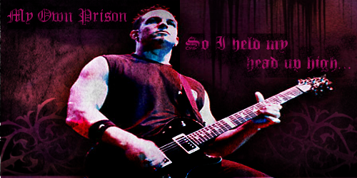
Thrav the gradient in the lower text makes the bottom half of the font blend into the background too much
Thrav what are those lines all over it?
Thrav why did you choose that weird colour scheme?
Thrav you spelt I'm wrong
Not very nice is it..
I don't see anything else. And I only saw the red when you said that.Andy92 wrote:Goodness no that's way too small to see lol. This one was more significant, I thought anyways.ThravRande wrote:The red in the upper right corner?Andy92 wrote:Surprised you haven't seen the "dead spot" in mine. It's a 2 second fix that I'm too lazy to do because it really doesn't matter all that much to me lol.
I've never claimed to be a pro. I claimed to have a bright monitor. Nor did I ever say there was anything wrong with it, I was just looking for whatever Andy thought was wrong with it.Jim wrote:There's nothing wrong with it dude, its great! Thrav just like's to think he's somewhat of a pro now he's realised GIMP is shit
Myles Kennedy wrote:I think you're as sharp as.... whatever's sharp.
anguyen92 wrote:Oh well. Deal with it.
Myles Kennedy wrote:I think you're as sharp as.... whatever's sharp.
Aww thanks manIncredible, sir. Very nicely done with the black borders and floating text in the gap. Probably my favourite of yours, even if it is sickeningly VERY "Harry"

I hope to be the 3rd lolAndy92 wrote:Yeah I think me and ITT were the only 2 that had any sort of success with GIMP so far lol.
anguyen92 wrote:Oh well. Deal with it.
Myles Kennedy wrote:I think you're as sharp as.... whatever's sharp.
anguyen92 wrote:Oh well. Deal with it.
anguyen92 wrote:Oh well. Deal with it.
anguyen92 wrote:Oh well. Deal with it.